Choosing the wrong paint colour is Melbourne’s most common painting regret. Homeowners commit to a colour in the showroom, have it mixed, spend a weekend applying it — and then stand back to discover it looks completely different to what they imagined. The blue-grey that looked sophisticated on the chip card reads purple in their living room. The warm white that looked inviting in the store looks yellow on their south-facing bedroom wall. The problem is almost never the colour itself. It is the gap between how a colour looks under artificial store lighting and how it behaves in your specific home, in Melbourne’s specific light.
Paint colours shift dramatically depending on your home’s orientation, the quality of natural light in each room, existing fixed elements like flooring and cabinetry, and Melbourne’s particular light quality as a southern hemisphere city. A colour tested under northern hemisphere conditions — which is how most paint chips and digital visualisers are developed — may read noticeably different in real Australian light. This guide gives you a practical, tested system for choosing paint colours that actually work, so you can commit with confidence rather than regret.
How to Choose Paint Colours: The Quick Answer
Key takeaway
The safest way to choose paint colours for your Melbourne home is to test large swatches — at least A4 size — painted directly onto the actual wall in natural light. Observe them across morning, midday, and evening. Shortlist three colours per room, test them in situ for 48 hours, and choose based on how they look in your most-used lighting condition. Never rely on paint chips, brochures, or digital screens alone — all three lie reliably.
Why Paint Colours Look Different in Your Home Than in the Store
Understanding why colour looks different at home than in the showroom is not just interesting — it is the single most useful thing you can know before you start choosing. There are four forces at work, and all four apply to every paint colour selection you make.
Metamerism: the colour-shifting phenomenon
Metamerism is the technical term for what happens when a colour looks different under different light sources. The fluorescent lighting in most paint stores emits a very specific spectrum of light. Your home’s natural light, incandescent globes, warm LED downlights, or cool white LEDs each emit entirely different spectrums — and the same pigment absorbs and reflects those spectrums differently. A colour that appears as a clean neutral grey under store fluorescents may shift perceptibly blue, green, or purple in your home’s daylight. This is not a product defect. It is physics — and it is why testing in your actual space is non-negotiable.
Undertones: the hidden colour beneath the colour
Every paint colour contains undertones — secondary pigments that sit beneath the dominant hue and become amplified under certain light conditions. A “warm white” has yellow, pink, or peach undertones that may be almost invisible on a chip but read distinctly on a large wall. A “neutral grey” may have strong blue or green undertones that only emerge in your north-facing room at midday. Learning to identify undertones before you buy — by holding the chip against a known warm or cool reference — prevents most colour regret.
Surrounding colours and the simultaneous contrast effect
No colour exists in isolation. Every colour you see is perceived relative to everything around it. Your flooring, cabinetry, furniture, ceiling, and adjacent walls all interact with the new wall colour through a phenomenon called simultaneous contrast. A cool mid-grey will look distinctly different when surrounded by warm oak floors compared to white tiles. The adjacent colours do not change the paint — they change how your eye reads it. This is why a colour can look completely different on a sample board you carry around the room versus when it is applied to the actual wall in context.
Melbourne’s light: cooler, bluer, and different
Melbourne’s position in the southern hemisphere means the sun travels across the northern sky rather than the southern sky as it does in the UK and US. This changes the quality and angle of light that enters your rooms at different times of day — particularly in south-facing rooms, which in Melbourne receive predominantly cool, indirect light rather than the warm directional light a south-facing room would receive in London. Colours developed and photographed under northern hemisphere conditions will behave differently in Melbourne homes. North-facing rooms in Melbourne receive the harshest afternoon sun, which can saturate and intensify colours significantly. South-facing rooms receive cooler, bluer ambient light that can make warm tones appear muted and cool tones appear stark.
Start With Your Fixed Elements
Before you open a single paint brochure or scroll through Instagram colour inspiration, walk through your home and take stock of every element that cannot easily be changed. These fixed elements are your anchor points — every colour decision you make must work with them, not against them.
Your fixed elements include: flooring (timber, carpet, tiles, vinyl), benchtops, cabinetry finishes, roof tile colour, brickwork, window frame colour, and any architectural stone or feature materials. Look closely at each element and identify its dominant undertone. Is your timber floor warm (golden, honey, amber tones) or cool (ash, grey-washed)? Is your kitchen benchtop warm white, grey, or charcoal? Is your brick warm red or a cooler brown-grey?
Once you have identified the undertone family of your fixed elements, apply the 60-30-10 neutral palette principle: 60% dominant colour (your main wall colour), 30% secondary colour (trims, joinery, adjacent surfaces), and 10% accent colour (feature wall, furnishings, accessories). If your fixed elements have warm undertones, choose wall colours from the warm family. If they are cool, choose from the cool family. Fighting the undertone of your fixed elements is the fastest route to a home that feels unsettled, even if you cannot immediately identify why.
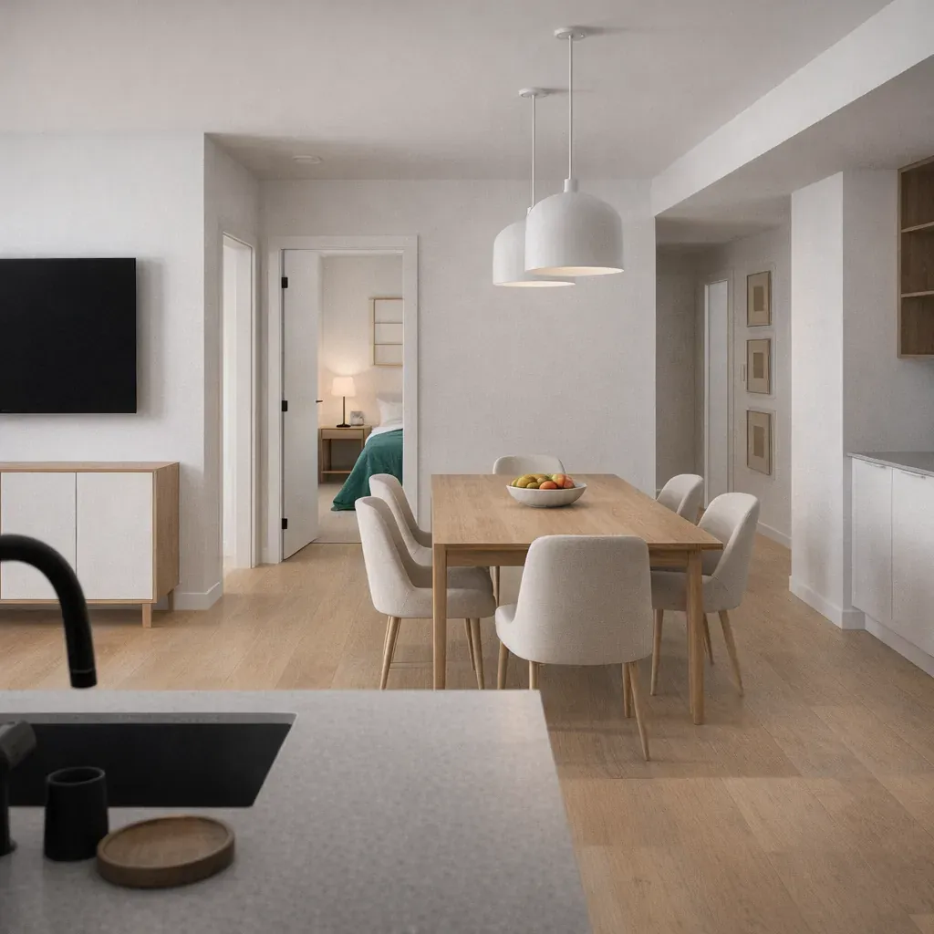
Interior Paint Colour Selection
Interior colour selection is a room-by-room decision, but it must be made with the whole home in mind — especially in open-plan layouts where multiple rooms are visible from a single vantage point. Here is how to approach each main area as part of our interior house painting process.
Living areas and open-plan spaces
In open-plan homes where the kitchen, dining and living areas flow together, the most important principle is colour continuity. Using the same wall colour throughout connected spaces — or very close variants within the same colour family — makes the overall space feel larger, more resolved, and more intentional. Avoid hard colour stops where one connected room ends and another begins. If you want differentiation between zones in an open plan, achieve it through furniture, rugs, or lighting — not abrupt wall colour changes. For Melbourne open-plan living rooms that get strong northern light, slightly muted or mid-tone colours can handle the intensity better than very pale or very saturated colours, which can both feel overwhelming in direct sun.
Bedrooms
Bedrooms benefit from calming, restful colours that support sleep and relaxation. Cooler tones in the blue-green and soft grey families perform well in bedrooms that receive morning or afternoon light. Warm whites with subtle blush or greige undertones create a cocooning quality in south-facing bedrooms where cooler ambient light might otherwise make the room feel cold. Avoid high-saturation colours on all four walls in bedrooms — they can feel stimulating rather than restful, and become tiring to live with. A single feature wall in a deeper tone behind the bedhead is an effective way to introduce depth without overwhelming the space.
Kitchens
Kitchens are high-activity, high-traffic rooms that need a finish as much as a colour. Choose colours with high light reflectance values in kitchens with limited natural light — lighter colours make small or galley kitchens feel significantly more spacious. For both aesthetics and practicality, use a durable low-sheen or kitchen-specific finish on kitchen walls — the surface needs to withstand cleaning, condensation, and grease without losing its appearance. Soft warm whites, light warm greys, and greige tones are consistently popular in Melbourne kitchen repaints because they work with both warm timber cabinetry and cool stone benchtops.
Bathrooms
Bathroom colour selection must account for the high-humidity environment. Choose a semi-gloss or gloss finish for better moisture resistance and easier cleaning — matte finishes in bathrooms trap moisture and stain more easily. For colour, lighter tones maximise the perceived size of small bathrooms and reflect the limited natural light most bathroom windows provide. Soft blues and blue-greens reference water naturally. Warm whites with pink or cream undertones create a spa-like warmth. Whichever colour you choose, pair it with a dedicated bathroom paint system or a moisture-resistant formulation — standard interior wall paint deteriorates faster in consistently humid conditions.
Hallways
Hallways are the most consistently underlit spaces in Melbourne homes. Natural light rarely reaches them directly, and artificial lighting in hallways tends to be minimal. The single most common hallway colour mistake is choosing a colour that looks fine on a large, well-lit wall sample but appears dark and oppressive when applied to a narrow, underlit corridor. A reliable rule: choose a hallway colour one to two shades lighter than you think you need. If you are drawn to a warm greige, test it in the hallway and also test a paler version of the same colour. The paler version will almost always perform better in real hallway conditions.
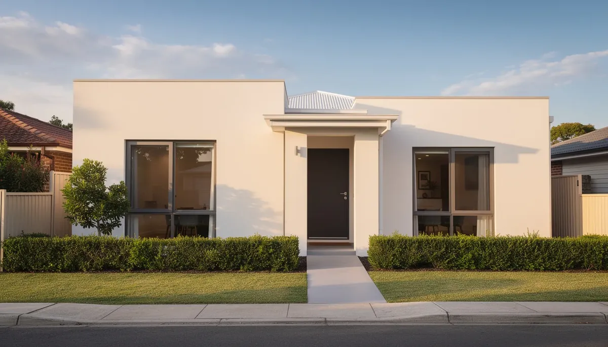
Exterior Paint Colour Selection for Melbourne Homes
Exterior colour selection for Melbourne homes involves a different set of considerations to interior work. The stakes are higher — exterior colour is visible to the entire street and affects resale value, neighbourhood character, and council compliance. Our exterior painting team works through all of these factors with homeowners before a colour is chosen.
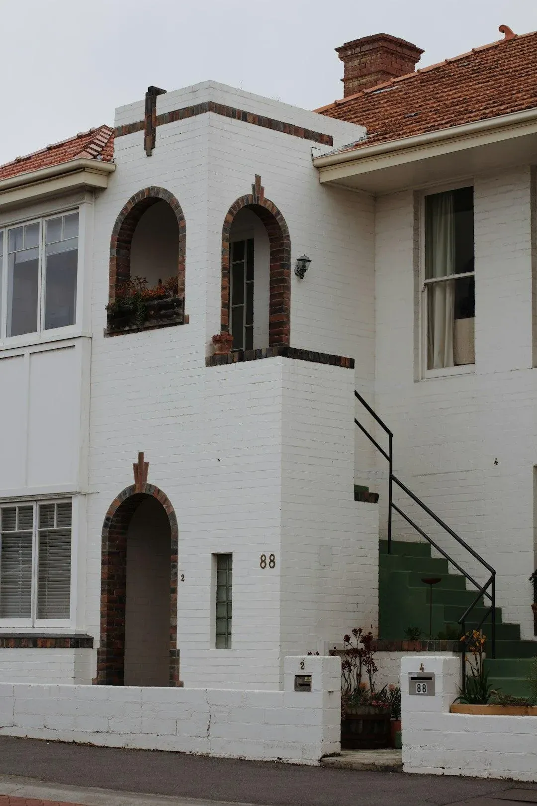
Heritage and council considerations
If your home is in an older Melbourne suburb — Fitzroy, Carlton, South Yarra, Richmond, Collingwood, Brunswick, or similar inner-ring areas — there is a real possibility it sits within a heritage overlay precinct. Heritage overlays can restrict exterior colour choices on primary facades, require council approval before repainting, or mandate use of period-appropriate colour palettes. The consequences of repainting without checking are serious: you may be required to repaint again at your own cost to comply. Always check with your local council’s planning department before committing to an exterior colour scheme in any inner Melbourne suburb.
Weatherboard homes
Melbourne weatherboard homes have a strong colour tradition rooted in Federation and Victorian-era palettes. Classic combinations that work reliably include deep charcoal or dark slate body with crisp white trim, heritage sage green or olive body with cream or off-white trim, and warm taupe or greige body with contrasting dark joinery. These palettes reference the architectural period of most Melbourne weatherboard homes and tend to complement the surrounding streetscape in established suburbs. For more contemporary weatherboard renovations, muted mid-tones with contrasting trim in a single accent colour create a clean, modern result without conflicting with the home’s original character.
Brick homes
The biggest mistake on brick homes is choosing a body colour that fights the brick tone rather than complementing it. Warm red brick pairs naturally with warm body colours — cream, warm white, warm grey, or terracotta tones in the trim. Cool brown or grey brick reads well with cooler body colours. If the brick is to be painted or rendered, the colour choice becomes more flexible, but undertone harmony still matters — the surrounding garden, fencing, and neighbouring homes all interact with the final result on a large external surface.
Roof colour and streetscape harmony
Roof colour is a fixed element in the same way flooring is — it anchors every exterior colour decision. A terracotta tile roof restricts the warm-cool range you can use on the walls without creating disharmony. A dark charcoal steel roof opens up far more options but requires care with very dark body colours that can make the home look heavy. Always assess the streetscape as a whole — the homes on either side, the nature strip, and the predominant material palette of your suburb all form the context in which your colour choice will be read.
The Dulux Weathershield system
For exterior repainting, Dulux Weathershield is available across thousands of colours and is purpose-built for Melbourne’s climate — offering UV stability, mould resistance, and flexible polymers that accommodate the expansion and contraction of timber and cladding through seasonal temperature swings. The Dulux exterior colour range includes everything from the lightest heritage whites to the deepest charcoals and provides reliable colour accuracy between chip and application when applied correctly over a properly prepared surface.
Key takeaway
Melbourne-specific note:In Melbourne, north-facing facades receive harsh afternoon sun throughout summer. Avoid very dark body colours on these elevations — dark colours absorb significantly more heat, which causes the paint film to expand and contract more aggressively through daily temperature cycles. This accelerates cracking and adhesion failure, shortening the paint's effective life. On north-facing facades, mid-tones and lighter colours consistently outperform very dark choices on longevity.
The Best Paint Colours for Melbourne Houses in 2026
While colour trends shift year to year, the most enduring exterior paint colours for Melbourne homes in 2026 share a common quality: they reference the natural material palette of Australian architecture and landscape. Deep charcoals that read as sophisticated and resolved — equivalents to Dulux Domino in the darker charcoal family — remain the most in-demand exterior body colour for contemporary Melbourne renovations. Warm whites such as Dulux Lexicon Quarter continue to dominate as trim colours and as full-body options on homes where a lighter result is preferred.
Natural greens and eucalyptus tones have moved firmly from trend to mainstream in Melbourne exterior palettes — these colours connect well to garden settings and complement the iron roofs and timber details common in inner-ring Melbourne homes. For period homes in heritage suburbs, the Dulux Heritage range provides period-accurate colour palettes developed from historical research into Australian Federation and Victorian domestic colour traditions, and these colours carry both aesthetic credibility and, in many cases, council acceptability in heritage overlay areas.
For interior colour trends in 2026, soft warm whites remain the foundation of most Melbourne interior repaints — specifically warm whites with barely-there greige or blush undertones rather than stark stark blue-cool whites. Warm greens in the sage and olive family have become the most popular feature wall and joinery colour choice for open-plan living areas. Earthy terracottas add warmth as feature wall choices in bedrooms and dining rooms. Timeless deep navy for kitchen joinery and cabinetry has sustained its popularity across multiple years and shows no sign of retreating.
A note of caution on trends: the most important consideration is always your home’s specific architecture and proportions, not the current year’s most-photographed Instagram colour. A period terrace in Fitzroy will look more resolved in a heritage-appropriate palette than in the trending colour of the season. Good colour selection enhances what is already there — it does not impose a foreign aesthetic on top of it.
How to Test Paint Colours Before You Commit
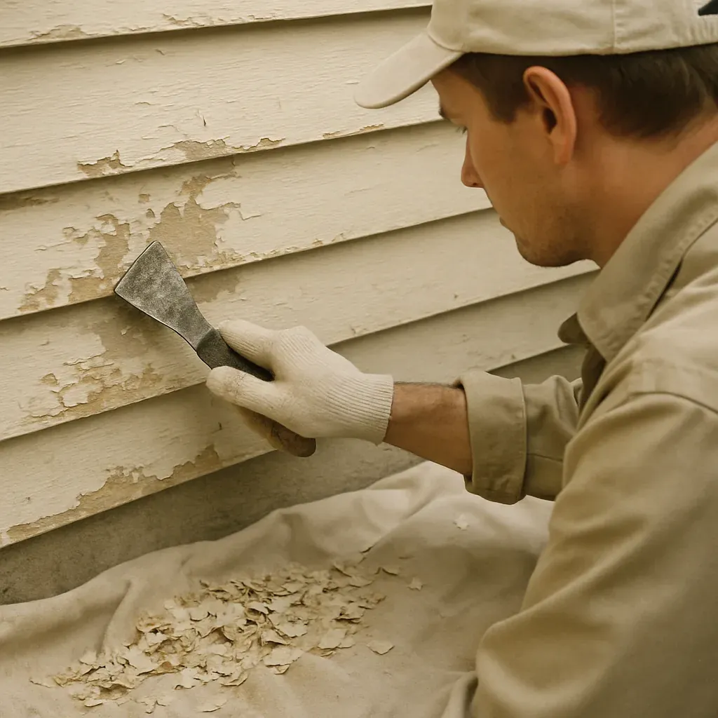
The testing process is where most colour mistakes are prevented — or made. There is a right way to test paint colours and several wrong ways that are unfortunately very common. Following the correct process takes a few extra days but eliminates the most expensive possible outcome: repainting an entire room because the colour is wrong.
- Buy sample pots, not chips. Paint chip swatches are printed on card under controlled conditions and are too small to represent how a colour will read at scale on a real wall. Sample pots are the only reliable starting point.
- Paint directly on the wall. Apply each sample colour in an A3 to A4 area directly on the wall you are painting — do not paint sample boards and carry them around the room. The wall’s existing colour, texture, and the room’s specific light all interact with the sample in ways that a moveable board cannot replicate.
- Test at all four lighting moments. Observe each swatch in morning light (before 9am), midday light (11am–1pm), late afternoon light (4–6pm), and under your evening artificial lighting. A colour that passes all four moments is a genuinely versatile choice for that room.
- Wait 48 hours. Fresh paint samples look different from fully cured paint — the depth and saturation of a colour shift as it cures. Making a decision on a sample painted that same day leads to disappointment when the full application looks different.
- Use digital tools as inspiration, not confirmation. The Dulux Colour Forecast and online room visualiser tools are useful for exploring possibilities and generating a shortlist, but they are not substitutes for in-situ testing. Screen calibration, ambient room lighting, and photography conditions all distort digital colour representation significantly.
Colour Mistakes Melbourne Painters See Most Often
After completing over 1,000 painting projects across Melbourne, the Modernize Solutions team has seen every colour mistake imaginable. These are the most common ones — and the simplest to avoid once you know what to look for.
- Going too dark in underlit rooms. A colour that looks rich and moody in a showroom photograph can feel oppressive in a small bedroom with one south-facing window. Always test dark colours in your actual room’s light conditions before committing.
- Pairing crisp cool-white ceilings with warm-toned walls. This combination creates a harsh, jarring contrast that draws the eye to the ceiling line rather than letting it settle on the walls. Match your ceiling white to the undertone of your wall colour — a warm white ceiling with warm walls, a cool white ceiling with cool walls.
- Using the same sheen level throughout. Mixing sheens creates visual definition and serves practical purposes. Low-sheen walls with semi-gloss trim and gloss doors is the standard combination because it provides a hierarchy that reads as intentional and professional.
- Forgetting the ceiling entirely. Most homeowners default to stark white on every ceiling without considering how a slightly warm white or off-white ceiling — just one shade warmer than the walls — adds coziness and resolves the room’s palette. Stark white ceilings in rooms with warm wall colours can feel unfinished.
- Choosing a feature wall colour before choosing the room’s main colour. The feature wall is a supporting player, not the lead. Always choose and test your main wall colour first, then select the feature colour to complement it — not the other way around.
How Modernize Solutions Helps With Colour Selection
Modernize Solutions offers colour consultation as part of every quote. With 30+ years of experience and 1,000+ completed projects across Melbourne, our painters understand how light, orientation, and architecture interact in Melbourne’s specific conditions in ways that no colour chip or digital visualiser can replicate. We have helped Melbourne homeowners across hundreds of suburbs find colours that work beautifully in their actual homes — not just in theory. We stock Dulux premium interior and exterior paint systems and can order custom-mixed colours across the full Dulux range. Our team is rated 4.8 stars on Google (154 reviews) and carries $20M public liability insurance on every job. Call 0451 040 396 to book a colour consultation alongside your residential painting quote — it costs nothing and prevents the most expensive mistake in home decorating.
Frequently Asked Questions
What are the most popular exterior paint colours for Melbourne homes?
The most popular exterior paint colours for Melbourne homes in 2026 are deep charcoals, warm whites such as Dulux Lexicon Quarter, and natural greens with eucalyptus tones. Heritage suburbs like Fitzroy and Carlton also favour period-appropriate palettes from the Dulux Heritage range. Classic combinations — charcoal body with crisp white trim — remain consistently popular across both weatherboard and brick homes throughout the city.
Should I use the same colour throughout my house interior?
Using the same base colour throughout an open-plan home creates visual flow and makes spaces feel larger and more connected. It does not mean identical colour on every surface — varying the shade slightly between rooms, or using the same colour family with different accents, avoids monotony while maintaining cohesion. The most important principle is ensuring there are no jarring colour stops where connected rooms meet at a doorway or opening.
How do I choose between warm white and cool white?
The choice between warm white and cool white depends primarily on your home’s fixed elements and the quality of natural light in each room. If your flooring, cabinetry or furniture has warm tones — timber, oak, brass — a warm white will harmonise naturally. If your home has stone benchtops, cool-toned tiles, or steel fixtures, a cool white is more likely to complement them. The most important step is testing both directly on the wall in your actual room before committing, because both warm and cool whites read very differently depending on the light in your specific space.
Can I change my exterior colour if I am in a heritage area?
It depends on your specific heritage overlay and local council guidelines. Many Melbourne heritage overlay areas — including parts of Fitzroy, Carlton, South Yarra, and Richmond — restrict or require council approval for changes to exterior colours on the primary facade. In many cases, approved colour palettes are provided. Always check with your local council’s planning department before purchasing paint for an exterior repaint on a heritage-listed or heritage-overlay property. Getting this wrong can require a costly repaint to rectify.
How many paint samples should I test before deciding?
Test a shortlist of at least three colours per room. Purchase sample pots for each and paint A4-sized swatches directly onto the wall — not on moveable boards. Observe each sample in morning light, midday light, afternoon light, and evening artificial light. Wait at least 48 hours before making a final decision, as fresh paint reads differently from fully cured paint. Do not rely solely on digital colour visualisers or paint chip swatches — both can be significantly inaccurate compared to real in-situ conditions.
Modernize Solutions
Melbourne's most experienced residential painters since 1987.