For most Melbourne homes the Dulux whites worth knowing are Lexicon Quarter, Vivid White, Natural White, Whisper White and Antique White USA. They aren’t interchangeable. The cool ones can look icy in a south-facing room, and the warm ones can read cream in bright north light. The single biggest tip? Test the undertone in your own light before you commit to a drop.
Want the right white chosen and painted for you? We’ve painted Melbourne homes since 1987. Get a free written quote and our in-house team will help you match the white to your light, your rooms and the right finish.
Still torn between whites? Our interior painters in Melbourne can put sample patches on your walls before you commit to a tin.
Key Takeaway
There is no single best white. The right Dulux white depends on your room's light. Use cool whites like Lexicon Quarter in bright north-facing rooms, and warm whites like Natural White or Antique White USA in cool south-facing rooms. Always test a large sample in your own home first.
Which Dulux whites do we actually use, and what are their undertones?
We paint almost every Melbourne home in one of about ten Dulux whites, and the thing that separates them is undertone, not the name on the tin. A pure white like Vivid White has no undertone at all. Lexicon and Lexicon Quarter lean cool and slightly grey. Natural White, Whisper White and Antique White USA lean warm.
Get the undertone right for your light and the colour name barely matters. Get it wrong and the most popular white in the country will still look off on your walls. Here is the short version of the Dulux whites we reach for, with the undertone Dulux and Australian colour consultants give each one.
| Dulux white | Undertone | Best use | Suits this light |
|---|---|---|---|
| Vivid White | None, ultra-pure | Ceilings, trim, feature joinery | Bright rooms; can be stark on walls |
| Lexicon | Cool, slight grey | Walls, trim, exterior | Bright north-facing rooms |
| Lexicon Quarter | Cool, soft grey | Walls and trim, open-plan | North-facing and well-lit rooms |
| Lexicon Half | Cool, clean and crisp | Trim or main walls | Bright rooms wanting a touch more white |
| White on White | Soft, slightly cool | Walls in modern homes | Bright rooms; hides minor flaws |
| Natural White | Very slight warm | Walls anywhere, trim | Cool south and east rooms |
| Whisper White | Warm, soft ivory | Walls, traditional homes | Cool or shaded rooms |
| Antique White USA | Warm, soft yellow | Walls, exteriors, with timber | Cool rooms; warms a space |
| Casper White Quarter | Warm, soft grey | Walls, trim, exterior | Neutral, works in mixed light |
| Snowy Mountains Half | Soft warm grey | Walls, trim | Neutral to cool rooms |
Sources for those undertones are listed at the bottom. The Lexicon family reads cool and modern, with a slight grey undertone, per Dulux. Whisper White is described by Dulux as a warm, soft white.
In our experience, most homeowners overthink the name and underthink the light. If Dulux versus another brand is still on your mind, our Dulux and Haymes comparison covers how the two brands compare.
Why do undertones matter more than the white itself?
Undertone is the faint colour hiding underneath a white, and it decides whether a white reads fresh or dirty next to your floors, your light and your furniture. Two whites can look identical on a chart and behave completely differently on a wall. That is the undertone showing up once it covers a whole room.
Cool whites carry a hint of grey or blue. They feel crisp and modern, and they hold up in strong light without yellowing. Warm whites carry a hint of yellow, cream or soft beige. They feel cosy and inviting, and they stop a dim room going cold and grey.
There is a second thing worth knowing about the quarter and half names. Dulux doesn’t lighten a colour by adding white. It uses less of the same tint, so Lexicon Quarter is the same base hue as Lexicon at a quarter of the strength. The good news for painters: those half and quarter strengths still cover well, so you don’t sacrifice opacity for a softer white.
Why does this matter for your job? Because picking a white is really picking an undertone that agrees with your light. Everything below comes back to that.
How does Melbourne’s light change a white?
The same Dulux white looks warmer or cooler depending on which way the room faces, and Melbourne’s mix of bright sun and grey, overcast days makes that swing bigger than people expect. A white that looks perfect in a sunny front room can look grey and flat in a back room that never sees direct sun.
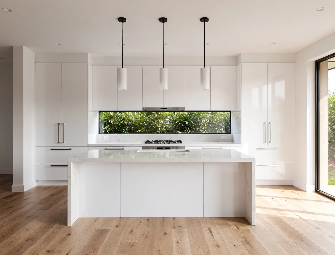
Here is the rule we use on every job. North-facing rooms get the warm, bright sun for most of the day, so a cool white like Lexicon or Lexicon Quarter balances that warmth and stays crisp. South-facing rooms get cool, indirect light and never catch direct sun, so a warm white like Natural White or Antique White USA stops them feeling cold.
East-facing rooms get warm morning light then cool off by afternoon. West-facing rooms do the reverse, cool in the morning then harsh and warm late in the day. On a grey Melbourne winter afternoon, a cool white can drift towards blue-grey, which is why Lexicon Quarter can look icy in low light. Ever walked into a freshly painted room that felt colder than the showroom card promised? That’s the light, not the paint.
Cool whites or warm whites: which suits your room?
Choose a cool white for bright, sun-filled, modern rooms, and a warm white for darker, south-facing or traditional rooms that need lifting. It really is that simple as a starting point, and it saves most of the regret we see when someone picks a white off a friend’s wall instead of their own light.
Cool whites suit contemporary homes, north-facing living areas, and anyone who wants a sharp, gallery-clean feel. Lexicon Quarter is the workhorse here, which is part of why it sits among Australia’s most popular whites (Dulux, popular whites, 2026). White on White is another option, with a soft undertone that helps it hide minor wall imperfections.
Warm whites suit period homes, weatherboards, rooms with timber floors, and any space that feels dim. Natural White is the lightest of the warm whites and so subtle it works almost anywhere. Antique White USA is warmer again, with a soft yellow undertone that makes it feel grounded and cosy next to timber. Whisper White sits between the two as a gentle ivory.
If you can’t decide, a near-neutral like Casper White Quarter or Snowy Mountains Half hedges your bets. Worth the trouble of choosing carefully? On a whole-house repaint, absolutely.
Should ceilings, walls and trim be the same white?
No, and using one white for all three is the most common mistake we fix. Ceilings, walls and trim do different jobs, sit in different light and usually want different whites and different finishes. Treating them as one colour flattens a room and shows up every imperfection.
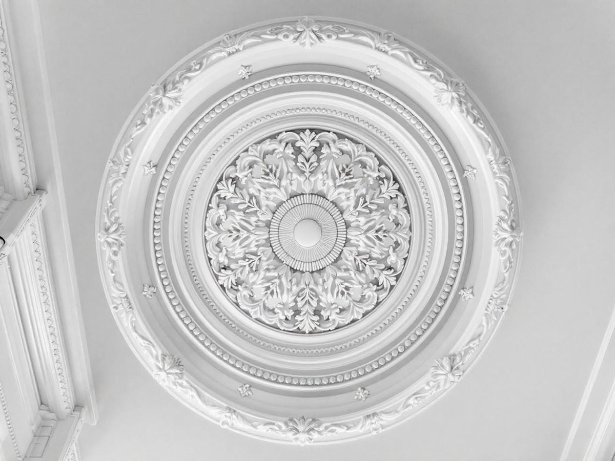
Ceilings should read clean and recede, so we use a flat finish in a pure or near-pure white. Vivid White is the classic choice for a crisp ceiling, but in a warm room a stark white ceiling can fight the walls. On those jobs we often run the ceiling in a quarter-strength of the wall colour so the change is soft, not jarring.
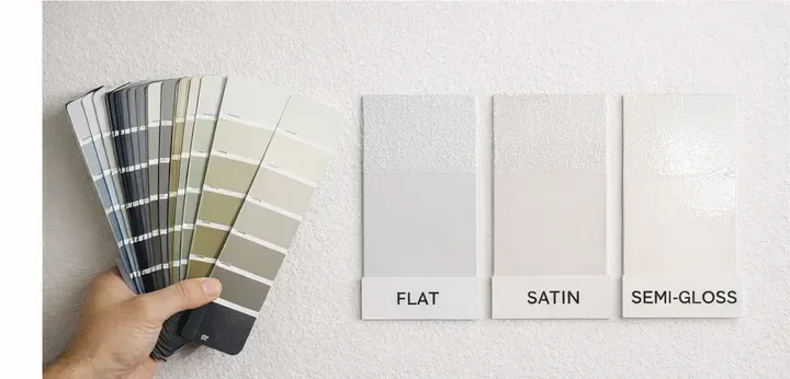
Walls take the white you chose for the light, usually in a low-sheen or matt finish. Trim, skirting, architraves and doors want a crisper, slightly brighter white in a satin or semi-gloss, both for definition and because higher-sheen finishes wipe clean. A reliable combination is warm walls in Natural White with trim stepped up to Vivid White or Lexicon Quarter. For more on matching sheen to each surface, see our guide to the best paint finish for walls, kitchens and bathrooms.
How do you match white trim with coloured walls?
Match the trim white to the wall’s undertone, not to a generic idea of white. Warm walls want a warm white trim, and cool grey, green or blue walls want a cool white trim. Put a cold, stark white next to a warm wall and the wall suddenly looks dirty. Reverse it and the trim looks dull.
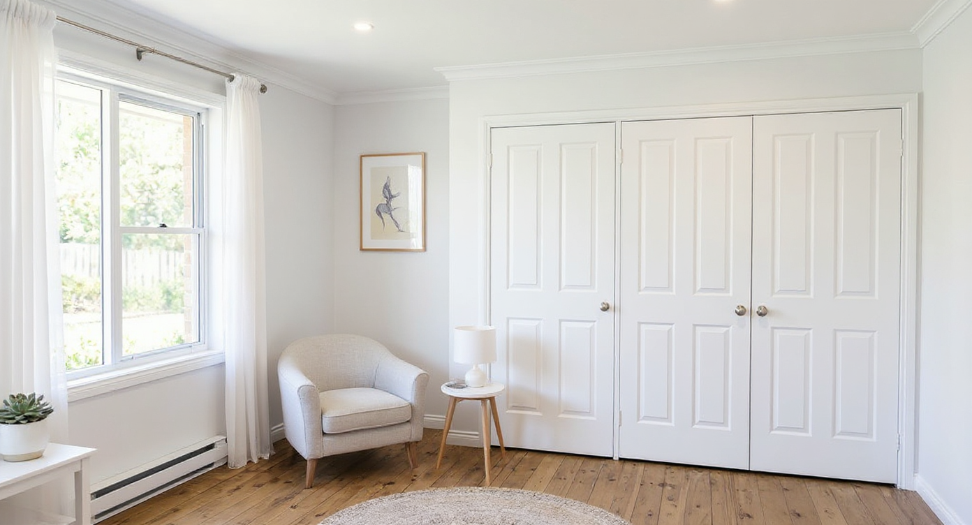
So for a greige, beige or warm-grey wall, reach for Natural White, Whisper White or Antique White USA on the trim. For a cool grey, sage or blue wall, reach for Vivid White, Lexicon or Lexicon Quarter. The trim should feel like it belongs to the same family as the wall, just cleaner and brighter.
One trick we lean on: take the wall colour and use a stronger white from the same temperature for the trim, rather than guessing. It keeps the whole room reading as one considered scheme. If you’re still settling on the wall colour itself, our guide on how to choose paint colours for Melbourne homes walks through it step by step.
How do you test a Dulux white in your own home?
Paint a large sample, at least A3 size, on two or three different walls and look at it across a full day before you order a single litre. A tiny chip held against a wall tells you almost nothing. White only reveals its true undertone once it covers real area in your real light.
Use a Dulux sample pot, or order their larger A4 colour swatches, and put the same white on a north wall and a south wall. Check it in morning light, harsh midday sun and again under your evening lights, because warm bulbs push every white yellower. Stand back. Live with it for a day or two. Does it still feel right at 7pm in winter?
This is the step homeowners skip and then regret. Across completed projects, the jobs that go smoothest are the ones where the white was tested properly first. If you’d rather hand the whole decision to someone who does it daily, that’s exactly what our interior painting team is for, and you can see how we work across the city on our Melbourne house painters page.
Not sure which white suits your light?
Family-owned, in-house team since 1987 with $20M public liability. 5.0 Star Reviews from Melbourne homeowners.
Frequently asked questions
What is the most popular white paint in Australia?
Dulux Lexicon and its softer version Lexicon Quarter are the whites most often named as Australia’s favourite, especially in modern homes. Dulux also lists Natural White and Antique White USA among its most popular whites. Lexicon reads cool and crisp, while the other two lean warm.
Which Dulux white is best for ceilings?
Vivid White is the popular pick for ceilings because it is pure with no undertone, so it reads as a clean, crisp white. For a softer look that suits warm rooms, we often put the ceiling in a quarter-strength of the wall white instead, which avoids a harsh white line where wall meets ceiling.
What is the best Dulux white for a south-facing Melbourne room?
South-facing rooms get cool, indirect light all day, so a warm white usually works best. Natural White, Whisper White or Antique White USA add warmth and stop the room feeling grey. A cool white like Lexicon Quarter can look icy or blue-grey in that light, so we steer clear of it there.
Should trim be a different white from the walls?
Often, yes. Trim, skirting and doors usually look sharpest in a crisper, slightly brighter white than the walls, in a satin or semi-gloss finish. A common setup is warm walls in Natural White with trim in a clean white like Lexicon Quarter or Vivid White for definition.
Is Vivid White too stark for walls?
It can be. Vivid White is an ultra-pure white with no undertone, so on every wall of a bright north-facing room it can feel clinical. It shines on ceilings, trim and feature joinery. For walls, most Melbourne homeowners prefer a softer white with a slight undertone.
Do I need to test a white before painting the whole house?
Yes. The same Dulux white shifts noticeably between a bright north room and a cool south room. Always paint a large sample, A3 size or bigger, on two or three walls and look at it morning, midday and night before you commit. It is the cheapest insurance you can buy.
The bottom line
There is no single best white for a Melbourne home, only the right white for your light. Cool whites like Lexicon Quarter, Lexicon and White on White earn their keep in bright north-facing rooms. Warm whites like Natural White, Whisper White and Antique White USA lift the cooler, south-facing rooms that Melbourne homes are full of. Pick the undertone first, match your trim to it, and test a big sample before you buy. If you’d like that done for you, get a free written quote and we’ll take it from there.
Sources
- Dulux, Lexicon Whites & Neutrals, retrieved 2026-06-29, https://www.dulux.com.au/colour/whites-and-neutrals/lexicon/
- Dulux, Lexicon Quarter Whites & Neutrals, retrieved 2026-06-29, https://www.dulux.com.au/colour/whites-and-neutrals/lexicon-quarter/
- Dulux, Vivid White Whites & Neutrals, retrieved 2026-06-29, https://www.dulux.com.au/colour/whites-and-neutrals/vivid-white/
- Dulux, Whisper White Whites & Neutrals, retrieved 2026-06-29, https://www.dulux.com.au/colour/whites-and-neutrals/whisper-white/
- Dulux, Natural White Whites & Neutrals, retrieved 2026-06-29, https://www.dulux.com.au/colour/whites-and-neutrals/natural-white/
- Dulux, Antique White U.S.A. Whites & Neutrals, retrieved 2026-06-29, https://www.dulux.com.au/colour/whites-and-neutrals/antique-white-u-s-a/
- Dulux, Australia’s Favourite White Paint Colours, retrieved 2026-06-29, https://www.dulux.com.au/colour/whites-and-neutrals/
Rather have a professional handle it?
Free on-site inspection and a fixed-price written quote, no obligation. Painting Melbourne homes since 1987.
Related service: Interior painting.
We paint across Tarneit, Pascoe Vale, Albion, Ardeer, Footscray, Brunswick and more, see our painting services in Essendon, or the house painters in Melbourne families have trusted since 1987.